Module Preview
MAとコンテンツを活用したリードナーチャリングガイド
MAを活用して効率的なリードナーチャリングを実現しましょう
コンテンツに含まれるもの:
- MAの概要
- リードナーチャリングの重要性
- MAでリードナーチャリングを行うための5ステップ
- MAを活用したリードナーチャリングの具体例



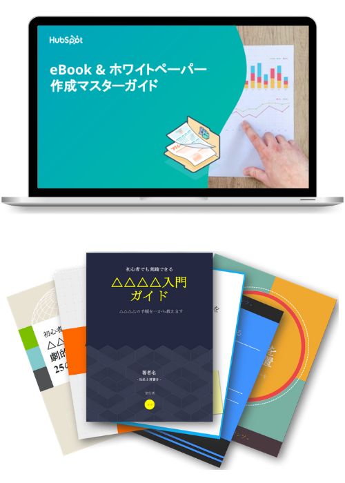
%20%E3%81%AE%E5%9F%BA%E7%A4%8E%E5%AE%8C%E5%85%A8%E3%82%AB%E3%82%99%E3%82%A4%E3%83%88%E3%82%99.png?width=509&height=297&name=%E3%82%B3%E3%83%B3%E3%83%8F%E3%82%99%E3%83%BC%E3%82%B7%E3%82%99%E3%83%A7%E3%83%B3%E7%8E%87%E6%9C%80%E9%81%A9%E5%8C%96%20(CRO)%20%E3%81%AE%E5%9F%BA%E7%A4%8E%E5%AE%8C%E5%85%A8%E3%82%AB%E3%82%99%E3%82%A4%E3%83%88%E3%82%99.png)



MAとコンテンツを活用したリードナーチャリングガイド
MAを活用して効率的なリードナーチャリングを実現しましょう
コンテンツに含まれるもの:
- MAの概要
- リードナーチャリングの重要性
- MAでリードナーチャリングを行うための5ステップ
- MAを活用したリードナーチャリングの具体例
MAとコンテンツを活用したリードナーチャリングガイド
MAを活用して効率的なリードナーチャリングを実現しましょう
コンテンツに含まれるもの:
- MAの概要
- リードナーチャリングの重要性
- MAでリードナーチャリングを行うための5ステップ
- MAを活用したリードナーチャリングの具体例
Module Preview
FAQ's
How To Use This Module
Tabs are used as a tool to navigate between related content within the same page, allowing visitors to explore and discover without leaving the page. Content is separately organized under a single tab.
Use Cases
Tab Content Options
Each tab can display rich text with media (image or video), or a multi-column layout with up to 4 columns containing images, headings, descriptions, and CTAs.
Media Layouts
Choose from 6 media sizes (x-small to full-width) with configurable content order (media-first or text-first). X-large media includes background color options.
Deep Linking
Configure query parameters to activate specific tabs on page load, enabling direct links to tab content.
The module supports deep linking by setting a `Deep Link Key` (query parameter name) and per-tab `Deep Link Value` fields:
- Example: Set `Deep Link Key` to `tab` and configure values like `overview`, `pricing`, `faqs`
- URLs like `?tab=pricing` will activate the matching tab on page load
- Uses contains matching: `Deep Link Value` of `pricing` matches both `?tab=pricing` and `?tab=compare-pricing`
Orientation and Alignment
Support for horizontal or vertical tab orientation with left or center alignment.
Multi-Column Mode
Alternative layout mode that displays content in responsive columns instead of media+text.
Get on-brand assets for your module
Guidelines
Character Count
- Limit tab labels to 2 to 3 short words
Image Sizing
- Full Width image size caps at 1080px wide on Desktop
- X-Large image size caps at 991px wide on Desktop
- Large image size caps at 768px tall and 542px wide on Desktop
- Medium image size caps at 510px tall and 340px wide on Desktop
Things to Know
- Tabs orientation can be set up as either horizontal or vertical
- Columns can we used within tab content

What's New?
| v4.1.0 October 2025
- This module now has more media options! Choose between large, medium, small, x-small and now Full Width and X-Large media sizes. X-Large size also has two background color options: Accent 1 and Accent 2
- The module now support deep linking to a specific tab
| v2.26.0 April 2025
- Now available to use on HubSpot Blog
| v2.23.0 March 2025
- This module now allows you to use columns within tab content
| v2.20.0 December 2024
- This module now allows for a Vertical Tabs orientation
| v2.16.1 October 2024
- This module now has more media options! Choose between large, medium, small and now x-small media sizes
| v1.0.0 August 2022
- This module now has more media and layout options! Choose between large and small media size, left or right media alignment and add rich text to the content copy