
Heat Map - Google Sheets, Excel, PowerPoint, PDF
Use this free heat map template to identify trends and patterns in your business.
Join thousands of professionals using this resource.
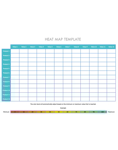
- Replace the sample data with your own dataset by typing in the values for each variable.
- Color-code the data — assign specific colors to low, medium, and high values to make it easier to interpret the results.
- Download the heat map in Excel sheets or PDFs.
- The color level will automatically adjust on Google Sheets based on the minimum or maximum value that is inserted .
- Analyze the patterns and trends the heat map reveals.
Frequently Asked Questions
A heat map is a visual representation of data that uses color coding to indicate the intensity of a particular value. You can use heat maps to identify trends and patterns in data such as website traffic, customer demographics, and product usage.
Heat maps come in all shapes and sizes, each with its own specific purpose. But here are some commonly used heat maps:
- Website heat maps: Shows website traffic and where users click on a page.
- Customer heat maps: Visualizes customer demographics.
- Product heat maps: Shows how often customers use different product features.
- Sentiment heat maps: Helps you understand how people feel about a particular product or service.
- Risk heat maps: Visualizes the risk associated with different activities or events.
Yeah, it's absolutely free! All you have to do is enter your contact info, and you can download the template (along with all the others in this collection). That's it.
Certainly! Feel free to personalize this heat map template to suit your own needs.
Related Tags:
See other Business Templates
-
Fact Sheet Template
Share information about your company with this compelling, versatile fact sheet template. -
Logic Model Template
Make planning and presenting projects a breeze with this free downloadable logic model template for Word and Google Docs. -
Sales Dashboard Template
Use this free template to learn which metrics drive results before automating with real-time sales software. -
Scope of Work Template
Want to outline the major details of an upcoming project? Download our free scope of work template and provide clarity to all stakeholders. -
Standard Operating Procedures (SOP)
Describe the how, what, and where of your organizational tasks to employees with this free SOP template -
Risk Assessment Template
Ensure your business is protected and avoid unnecessary risks with our free template! -
Gap Analysis
Conduct thorough assessments of your current state vs. goals with this free gap analysis template. -
Root Cause Analysis
Use this free root cause analysis template to identify the source of business issues and create a plan to prevent them. -
BCG Matrix Template
Strategically manage your company's products with the help of the BCG Matrix. -
Eisenhower Matrix Template
Use the Eisenhower matrix to prioritize your activities based on degree of importance and level of urgency. -
Action Plan
Use our free action plan template to help get your business or project goals off the ground. -
CRM Spreadsheet Template
Track customer relationships, sales activities, and follow-ups when you're managing your first 25-50 customers.
Get the template for free!
Download Free Template
Available for Google Sheets & Excel & PowerPoint & PDF
Form not available